

Colour theory for quilt making

Choosing colours for your next quilt project can feel a bit daunting if you don’t know much about how they work together. Gathering fabrics and spending time making something special, then to find out it doesn’t look as great as it could because the colour selection was wrong from the start.
Colour is part instinct and part science – you can learn to understand it, how different hues play with each other, or simply don’t work at all. Often it takes practice, combined with making mistakes, then analysing those mistakes to move forward for a better result next time.
Colour is part instinct and part science – you can learn to understand it, how different hues play with each other, or simply don’t work at all. Often it takes practice, combined with making mistakes, then analysing those mistakes to move forward for a better result next time.
I’m going to share the basics of colour theory today and then over the next weeks will show a bit more about how to bring it into your fabric selection for quilt making or slow stitching projects.
Let’s start with the terms and what they mean, because sometimes having the language helps to better understand what you want to achieve.

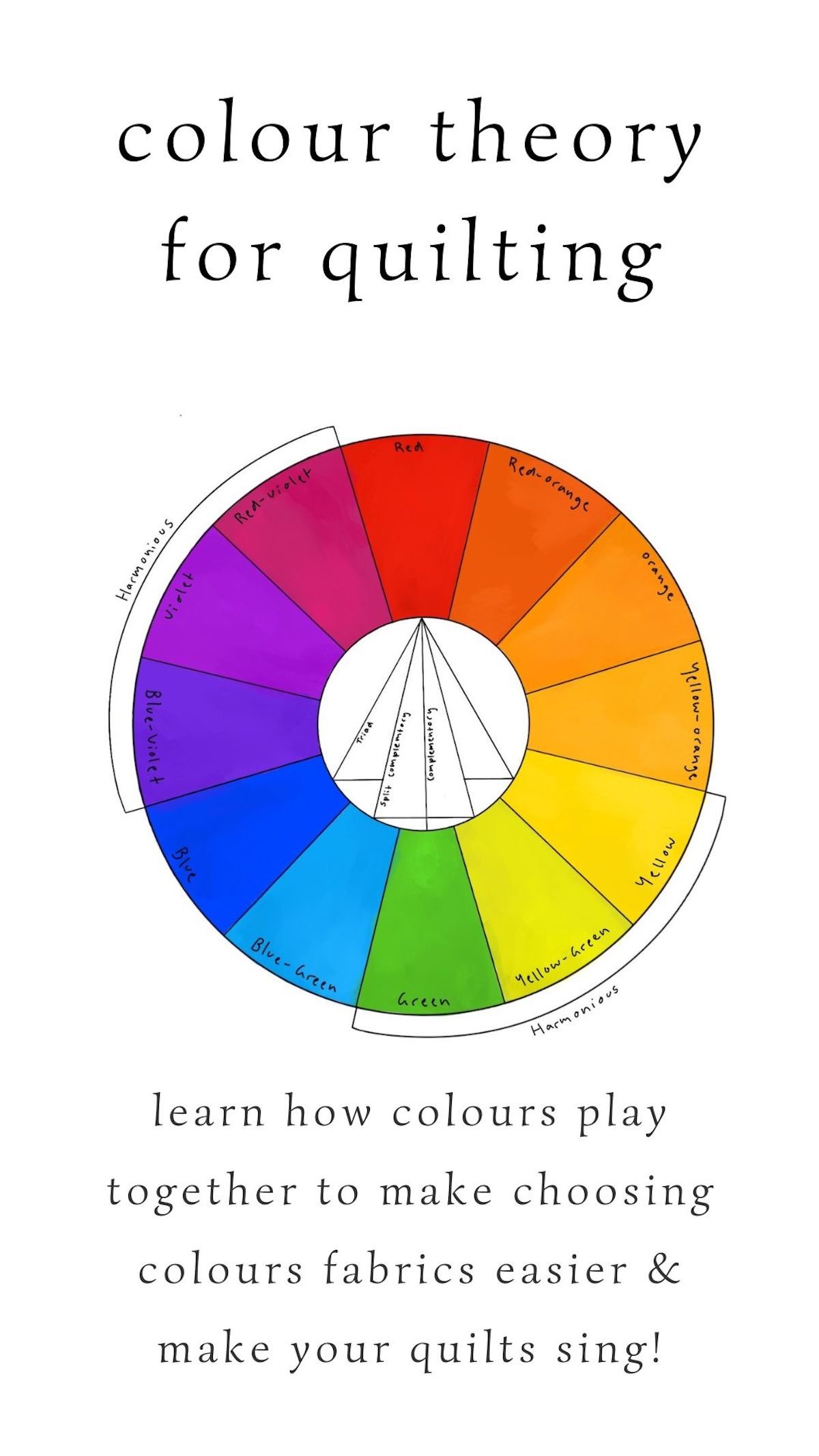
Colour is a general term we use for everything we see on the colour wheel, or in nature; it encompasses all hues, tints, shades and tones. The main actual ‘colours’ are pure colour such as red, blue and yellow (primary colours), or green, orange and purple (secondary colours), or mixed colours such as orange-yellow, yellow-green, blue-green (called tertiary colours where neither colour is dominant).
Primary, Secondary and Tertiary ~
Primary: These are the colours that combined create all the other colours. Pure red, pure blue and pure yellow are the primary colours.
When primary colours are mixed you create the secondary colours
Red + yellow = orange
Red + blue = purple
Blue + yellow = green
Blue + yellow + red = brown (the type of brown will vary based on the ratios of the primary colours you use)
When you mix primary with secondary you get tertiary colours, where neither colour is dominant.
Purple + red = red-purple
Red + orange = red-orange
Yellow + green = yellow-green
Hues ~
When we look at a colour wheel or all our fabrics, we usually simply think of them as colours. Beyond the six primary and secondary colours of the rainbow, we assume that everything else is a colour too. And in a sense, they are, but whereas red is the true colour, hot pink is a hue, or blue is the colour and turquoise is a hue. Hue defines how much white, black or grey a colour has.
TINT refers to any pure colour that has white added to it. Such as red + white = pink, or blue + white = sky blue. Pastel colours are tints.
TONE goes one step further where you break down the additions to get different hues. Tone is how much grey is added to any colour. So red + grey, or orange-red + grey. Tone will make your colour less saturated and more muddy, rather than when you add black.
SHADE is a pure colour with black added to it. Blue + black = deep indigo, red-violet + black = maroon.


HARMONIOUS colours sit side-by-side on the colour wheel. Harmonious colours are often seen in nature, and are very beautiful together but do create a quilt that is more subtle rather than a louder or more bold quilt. Yellow-orange, yellow and green-yellow are harmonious
COMPLIMENTARY are colours directly opposite each other on the colour wheel, such as green & red. These technically play nicely with each other in a quilt, but it does depend a lot on the hue of each colour. I.e. – a maroon (red + black) might not play well with a pastel green (green + white).
TRIADIC are the three split colours across the colour wheel. They’re equally spaced from each other, such as blue, red and yellow. Or green, orange and purple. Or a green-yellow, orange-red and violet-blue are triads (though this can sometimes be harder to see in a pull of fabrics). As triad colours are contrasting, they create drama in your quilt, but you can tone this down by using different hues and different saturations of each hue. Such as toning (adding grey) down all the triads, or lighting/tinting the hues (adding white), which creates a more pastel and softer quilt.
Using one hue as an accent helps as well, so consider how much of each fabric you use in your quilt. With improv quilting this isn’t always obvious when you start playing with creating your blocks, but once you get a few together on your quilt wall / lounge room floor, you’ll start to see if one shouts louder than the others. And by analysing this you’ll start to notice if you like that or want to quieten it a bit by adding another hue in the triadic scheme.

Temperature ~
WARM colours are usually defined as reds through to the yellows. A violet with more of a red undertone than a blue undertone is warm. Whereas a violet with more blue than red is a cool colour. A green that has more yellow undertones falls into the warm side of the colour wheel, but a green that has more blue undertones falls into the cool side.
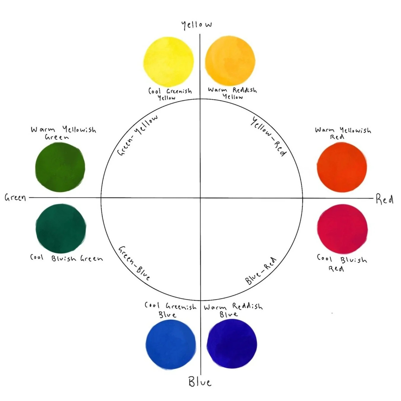
COOL colours are defined as violet through to yellow-green. This is probably the hardest to explain out of all the colours, and a lot of this does come down to using your instinct and getting better at looking at the hues and analysing why you think they do or don’t work. Blue falls into the cool side of the colour wheel, but there are still warmer-toned blues and cooler-toned blues. A blue with a red undertone will look more purple, and this means it’s warmer, and a blue with more yellow will look more like a cyan or aqua, and this will be a cooler colour.
Greens and purples sit on the edge of the warm and cool colour palette, and it generally comes down to how much blue or red is in each hue. Sometimes you can tell straight away and sometimes it’s really hard to work out which line it fits on.
Putting colours that you’re not sure about next to other colours can help guide you. Try laying a cool colour next to the unknown hue, then lay it against a true red. This could possibly solidify the answer. Sometimes it simply confuses you more.
Remember that it’s your quilt, it’s your eyes and instinct to trust. If you can’t tell the difference now, then I will declare that no-one else will see the difference once your quilt is made.
I often think about when I’ve been on stage (a long, long time ago) and you mess up your lines. The audience can’t tell the difference unless you stand there, looking vacantly around clutching for the answer, or if you admit the mistake after the show. It doesn’t change their experience of the performance if you present it with confidence, because they’re looking at it with fresh excited eyes.
Cool colours recede in your quilt, whereas warm colours pop. You can play with the quantity of cool and warm colours to see the difference between how they interact with each other, and the overall feel you want for your quilt.
Value ~
Dark fabrics have a low value. Light fabrics have a high value. Using a combination of values helps to make our quilts more interesting.
If you have harmonious hues (eg. all blues) you can create contrast and make a quilt more interesting by changing up the value of the fabrics. Or if you have contrasting fabrics you can create more balance by keeping the colours a similar value.
You add harmony when values are all the same. You add contrast when there are both high and low values in one quilt.
Remember that value is how much light (white) or dark (black or grey) in your fabric.
Adding Depth ~
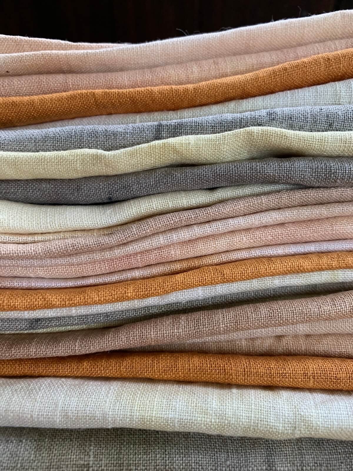
Using a higher value fabric, which will be lighter, for one hue if the rest of the quilt has lower value/darker fabrics will give your quilt more contrast, and can make it look overall more interesting. If you want more contrast, increase the difference between value – from super light to darkest dark. Although, be careful when mixing fabrics that are BOTH different values and hues. For example, a deep indigo blue with a lighter blue or cool-toned pink will create contrast, but still look beautiful because they are harmonious. But using a deep maroon red may look off when paired with a pastel or lighter green.
CLARITY can make a big difference to if you quilt actually works or not. You can work with all the other aspects (saturation, harmony, contrast) but muddy or clear fabrics fight with each other quite a lot. You might have more of one than the other depending on what you’re naturally drawn to. Many people do like working with muddy, whereas others might prefer working with clear. Neither is better; they are the wonderful ways that a quilt becomes your personal voice. You might find that you have an even(ish) mix in your stash.
A clear colour has very little black or grey and is quite bright bright looking; such as a sky blue, hot pink or canary yellow.
Muddy colours have more black or grey. Muddy colours will often be more natural looking, such as a brown-pink or an olive green. Clear hues look best with other clear hues, whereas muddy hues look better with muddy hues. Mixing these can make your quilt look off, and always gives it a ‘dirty’ and incoherent feel.
Pin this for later!
You might enjoy reading these blog posts too:


